Showing posts with label Portfolio. Show all posts

Wednesday, November 12, 2008

The Dragon's Unexpectedly Cute Spawn

Yes, I know I promised to keep the baby blogging to a minimum, but I've got relatives crying for blood over the lack of baby pictures.
Besides, just look at this cutie! I know drag queens who would kill for those lashes.

Amongst the overwhelming flood baby shower gifts, and even enough hand-me-downs to cloth an Appalachian village of infants and toddlers, was a 10 mega pixel DSLR.

One of the other productive things I've been doing, is working on an actual website for my artwork and photography and such. It's still a little barebones, but there is a gallery of baby photos. All the other galleries are public, but I've decided to require a password for access to the baby photos. I mass emailed a bunch of folks with the password, but if I neglected to send it to you, or it got caught in your spam filter, let me know and I'll send it to you.

I just figured only friends and family needed access to a soon to be vast archive of baby photos. Plus, my buddy Sky caught some flack for posting an innocent photo of his twins naked in their wading pool, a while back.... and well, I guess a little online paranoia is not a bad thing.

So while Honkytonkdragon.com is not fully functional at this time, there are some cool pictures up over there, mostly things I've posted here in the past, but collected all in one place. And there is more to come, of course. And if you have the misfortune to be one of the dragon's friends or family, and want to bask in the glory that is little miss Zoe, drop me a line, and I'll get you the access info.

Tuesday, August 05, 2008

Zoe Read Armstrong Auerbach

That's right folks, the Dragon is a daddy!

Jes had about 31 hours of early labor and about 2.5 hours of active labor. The attending midwife and nurse both were amazed at how quickly and smoothly Jes delivered.

Mom and baby are both recovering fine, thanks for asking.

So far Zoe has been a joy. She is a calm, curious infant whose most frequent expression is dubious but observant.

Though I son't intend to make this a baby blog, I'm sure more details will come.

For now we'd like to clebrate Zoe's arrival with song.

Isn't she lovely?


or for those you are the freakier side of reality, how about how about East German Punk Diva, Nina Hagen's trippy song celebrating the birth of her daughter Cosma Shiva?


And last, but certainly not least, I'd like to share the song that local Redding musician Mark Hinkley performed for us at Jes's Baby shower.

Zoe's Song

May you be blessed with loving kindness,
May you be well,
May you be graceful and at ease,
May you be happy.

May your first sight be of your family,
May you reach out,
And keep your family close to you,
May you be happy.

May your first steps grow strong and steady,
May you cry out,
Then may learn to sing of love,
May you be happy.

Sunday, April 13, 2008

New Painting: January Sky


Just finished this painting, and I'm pretty happy with it. It is the most intensive piece I've completed in like four years. There are little bits I was tempted to keep refining, but a voice inside my head started saying, "Step away from the easel, and no one will get hurt..."
This of course is a reference to an old artist's joke:
Q: How many people does it take to paint a painting?
A: Two. One to paint, and the other to shoot them in the head, when it's finished.

If this image looks familiar, that's because it's something I've been working on for several years. It originated with a photo I took in my senior year at Evergreen.
This image of my good friend Sky was part of a series of digital photos I took of friends in bars. Here is the original...

While I did a little editing of the digital file in Photoshop, this consisted of nothing more than using the computer as a digital darkroom. I fiddled with contrast, color balance and the like, but the source was always one image. The image itself was made possible by altering the digital camera's settings to operate in low light with no flash, which is why it has the appearance of a double exposure. This is still something that interests me, the ways in which a digital camera acts differently than film.

Anyway, I've always liked the photo, though I had the feeling that I saw a potential in it, which others didn't quite grasp.
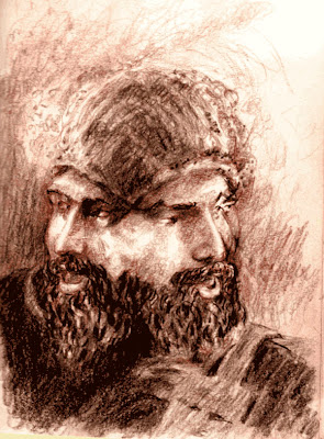
A couple years later, I finally got around to playing with the image again. This sketch was actually done on a plane, during my first trip out to CT. I'm very fond of it, as I am of the original photo, though for different reasons. It was one of the first serious sketches I completed after a long dry spell. It deconstructed the photo, which was very 21st century in its conception, in a very classical manner. That amuses me, in a perverse way. Plus, Jes's father, David, was very emphatic in his appreciation of the sketch over the photo. As best I can tell, David has very a sophisticated, albeit conservative, aesthetic. So, not long after returning home from that trip, I skritched down some outlines with vine charcoal on an extra canvas...
And then I let that canvas sit for a year.

So for my birthday last year, Jes and her parents chipped in to get me a new easel. A really nice new easel, the kind of tool, gift which demands use. So I started going through my stack of blank canvases, and there was that under-drawing. At the time, I was in the mood for some daring experimental work, and indeed I started several other pieces which are more abstract and non-objective. You can see the influence of this approach in the image above. But once I gotten to about this point on this painting, it had started to dominate my thinking.
At about this point, I'd abandoned all pretension of abstraction and non-objective painting. Unsatisfied with how the work was progressing based on those strategies and the original sketch, I returned to the original photo. There was something in it which had originally entangled my thinking about the piece, an ephemeral quality which was only hinted at in the sketch, and was missing thus far in the painting. At this phase, you can see where I attempted to do away with some of the more obtrusive mandala-like elements which had existed previously in the background.

There is no set interval to these work-in-progress shots. But I think the progression is interesting. Though not the best example, this work does show some sign of what technology can mean to traditional artistic endeavors. Though this work was executed in acrylic, smearing pigments on prepared cloth is an antiquated endeavor. Still, for all the convenience of modern media, this painting will be around centuries after inkjet prints have faded, and optical disks have become unstable. All our advances have yet to displace the smearing of minerals coated in a binder on a substrate.

At about this point, I began to be dissatisfied with the composition as it had been scrawled on the canvas in charcoal.
Oops. Too late for that. Well, I guess I started with some abstract intentions, so at this point I figure I'll just tweak the abstracting of the background and color strategies to compensate.

Almost done here, the magenta shades on the left side are pretty well finished. But it took several hours of work after this point to get the depth and texture which I felt the piece needed on the right hand side.


Though the depth that is achieved through varying layers of glazes, velaturas, and scumbling, can't really be captured by photography, you can see how the layers of colors interact. So some of the depth which is readily apparent in the actual painting is lost here, you do get a sense, though flattened, of how color was used in the piece, as well as some of the brushwork.

January Sky is 16" x 20", Acrylic on gallery-wrapped canvas, ready to hang, and can be yours for $1000 USD. Contact information can be found on this page, or notify me of your interest in the comments.

(Edited 04/15/08. Posted better quality images of the final painting and the closeup. Also, removed text complaining about the poor quality of those initial photos.)

Monday, April 07, 2008

Mother of the Other

Since "Breaking Bad" is in reruns, I'm painting tonight. And going through my clip file, I discovered this blast from the past.
This mural is the largest painting I've executed to date. It was never titled, but I'm posthumously saddling it with the name "Mother of the Other," which if my beer-addled brain serves me right, kind of sums up the gist of what I was shooting for.
I was never completely happy with this piece. It was intended to be a basis for a "free-wall" during Freak-Fest, a neighborhood arts festival held in downtown Little Rock, on what ended up being the hottest day of the year. In fact on that particular July Saturday in 1995, Little Rock racked up the highest temperature in the nation. And that's not taking into account the humidity...
Anyway, my intention with the piece was to provide a basis for the artistic additions of whoever decided to slap paint to bricks. The wall was at that time the property of Dottie Oliver, publisher of the Little Rock Free Press, and she'd volunteered it for the festival. As the coordinator of artistic affairs for the festival, I'd hoped that by giving the graffiti wall an underlying skeleton, the chaos of hundreds of various artistic visions might end up being something worth looking at.
Unfortunately, or fortunately depending on how you look at it, Dottie loved my under painting so much that she didn't want anyone painting on top of it. The free-form graffiti ended up taking place on a donated VW Westfalia van.
This always bothered me a little bit, because well if I'd known I was doing a solo wall mural, I would have put a little more effort into it. So it goes, I suppose.
I suppose I should mention at this point that the paint for this piece was graciously supplied by Golden Artist Colors. Of course I would have used Golden anyway for this, as acrylic is the most suitable medium for outdoor murals, and well, Golden makes the best acrylics. Which makes sense when you realize that the late Sam Golden, along with his uncle Leonard Bocour, helped invent artists acrylics.
History of artist's materials aside, in hindsight, I'm fond of this mural. It melds several layers of my visual thinking from this time period. I'm hesitant to drain what little mystery the piece may have by over-explaining it, so I'll just leave it as a meditation on the other, the alien, and female fertility. In other words, the Mother of the Other.
This mural was on a wall near 7th and Izard in downtown Little Rock. I'd be extremely grateful if any of my Little Rocker readers could let me know if it still exists. Iain de Sane, I'm looking at you.

Monday, December 10, 2007

The Dragon's Portfolio and Guerrilla Marketing

I began this blog almost two years ago with intent of it being a platform for promoting my creative endeavors, as well as a tool for archiving the assorted internet weirdness that inspires me. In that time, well it's turned into something slightly different.
Ironically, I guess one of the reasons for that divergent development is that I have a hard time tooting my own horn, despite that being the original purpose of this blog. It's not that I have low artistic self-esteem or anything. Far from it, I probably think more highly of my talents and potential than my output warrants. But self-promotion just seems kind of rude... like a dinner guest who only talks about themself... (Just counting the first-person singular pronouns in this paragraph makes me cringe...)

Anyhow, as I make baby steps to developing some self promotional materials, I've started referring potential contacts to this blog, and have realized that there is no easy way for readers to find my personal works. Clicking on Painting just gives you every post on painting, frequently featuring works by other artists which tickled or inspired me. Same goes for Art or Photography.

So to make it more convenient for those who might be interested in browsing images created by yours truly, I've gone through and labeled posts with my personal works as Portfolio.

If you are interested, you can always check a different version of my art portfolio here, without all my usual insipid ramblings.
The same goes for the photographic portfolio here.
Yes, I'm working the free online image storage services for all they are worth. My artistic endeavors are being operated on a hobbit's shoe-string budget (that is to say nonexistent), so if you'd like to see these images in a more professional dedicated environment, you could always buy one of my t-shirt designs or one of my fine-art prints...
On the other hand, if all the above has bored you to tears you could just use the Scooters label for the dedicated Scootin' posts, or the Steampunk label for some RetroFuturist love...

Any artists out there have any other suggestions for guerrilla marketing tools and techniques, or ways to overcome a Mid-Western feeling of self-promotion being cheesy, greasy, and sleazy? I'd love to hear some conversation on this in the comments.

Saturday, November 24, 2007

Dragon Skins

Well I finally got around to making some t-shirt designs, which you can get online.
My favorite, so far is this Lambretta, which I think looks best as white ink on a black garment.
I predominately buy and wear black t-shirts, so while I'd been thinking about doing t-shirts online for awhile, I was stuck on finding a way to do quality prints on black shirts. I'd come across Spreadshirt sometime ago, who will allow you to do plot printed images on colored shirts, in addition to the digital prints which are more common. Digital prints are swell and all, but are delicate. I wanted to do the plot printing because it works better on dark garments, and holds up better to repeated wearing and washing. The problem was for this type of print they want a vector graphic file... ala Illustrator. While I'm something of a wiz with Photoshop, I just never successfully picked up Illustrator until recently.
Luckily that changed, when I discovered VectorMagic, a beta site put up by Stanford. It's an online tool which converts jpgs and other raster files to eps files, with all the paths and such ready to go in Illustrator. So I've been playing with this for the last week and a half, bouncing images between Photoshop, VectorMagic, and Illustrator. If like me, you're experienced with Photoshop but have been intimidated by Illustrator's learning curve, I recommend dinking around with VectorMagic, it really helped me transition into the different mindset, and allows you easily start with images you already have.


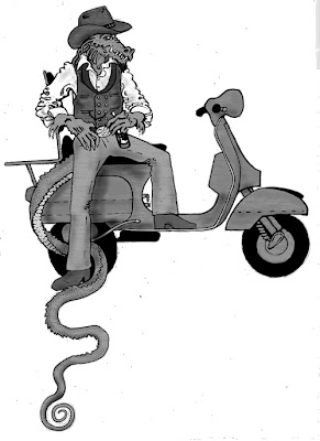
I'd been hoping to do a Honky-Tonk Dragon shirt, using some of the images I've already created. Unfortunately these are all comprised of many smooth gradients of gray, and require a lot of tweaking. The above image was the easiest to get transformed into something that would meet SpreadShirt's printing requirements. While I like the image in its original form, I'm not sure how I feel about this incarnation.
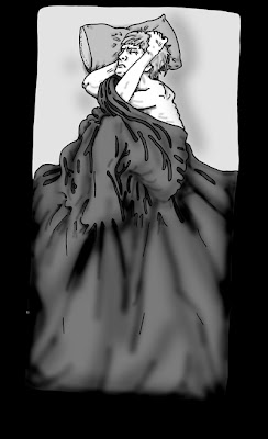
This last image (the above is the black-on-white version, it's also available white-on-black) is something I've been playing with for a few months. A version of it appeared in a dream as a kind of spontaneous graffiti glyph intended to guard against psychic warfare... Give me a break OK, it was a dream. Actually any dream where you turn the tide from being a nightmare by busting out a spontaneous spray-paint sigil is pretty good.
Anyway the image stuck with me, but I hadn't been able to satisfactorily capture it until now. I'm calling the design "I Must Not Think Bad Thoughts" after the great song by the old-school punk band X. Wear it and let the world know "evil to those, who evil think."

Stay tuned, I've got a few more designs in the works, scooter themed, steampunk themed, and hopefully even steampunk scooter themed. Till then check out my shop, Spreadshirt's cool, you can put these designs on different garments, change the color of the ink or even of what it's printed on. If you come up with a cool combination I've missed, let me know.

Friday, November 16, 2007

Art and Commerce

I promised some scooter photos a couple days back, so here you go...

Actually, fulfilling that pledge is only a secondary purpose of this post. The real motive behind this post is to notify the world that I now have a small select group of fine art prints available for purchase at Imagekind.
And by small I mean, um... three.
For the past week or so, I've been distracted from my usual quirky, snarky blogging duties, by a personal experiment in the abomination of intellectual endeavor which is trying to marry art and commerce.
I've known way too many extremely talented individuals who steadfastly believed that trying to make a buck off of their creativity was a lost cause, and thus exiled themselves to the service industry. Seriously, for every waiter who wants to act, there is a Van Gogh busing the tables after them. And as much as I am prone to argue with these folks, and at least try and encourage them to SHOW other people their work, I am a crappy example. Sure I spent several years hawking paintings in group shows, and small exhibits in coffee houses and bistros, but I've let defeat and apathy get the best of me. I haven't made a serious effort to show and sell my work for sometime, cordoning myself off from the world in a labyrinth of rationalizations and self-pity.
Anyway, lately I've been trying to hack my way out of that maze. I haven't made as much progress as I might like, but I do have a few things to show for the struggle. Like the above digitally edited photo of an extremely Mod Modern Vespa , taken at AmeriVespa in Seattle this past summer.


Also available are prints of this image, called Goldmund's Gaze. It is a highly digitally edited image of a painted collage I did a few years back in a fitful rage of creativity after reading Narcissus and Goldmund by Herman Hesse. The original is currently in the collection of Ben Coffraw.


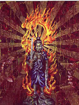
And last but not least, prints are finally available of this painting of Fudo Myo, or Acalanthara Vidya Raja. More simply called Demon Buddha, I finished this painting (still one of my favorites) in 1994. It was featured in the 40th annual Delta regional exhibit in 1995. Since 1996 or so, it has been in the private collection of a thief.

Tuesday, November 06, 2007

Some Photos From the Dragon's Archives

So yesterday I promised to post some photos I've come across whilst assembling my portfolio. And for once, I'm not a day late, just a dollar short.

For starters we'll do a coast-to-coast, waterfront theme.
Here are a couple of my favorite shots of Puget Sound's Mud Bay, near our old place in Olympia.


And here are a few shots from Ocompo beach in Westport, CT, looking into Long Island Sound.


Coming soon, portraits, digital abominations, and of course scooters.

Monday, November 05, 2007

On a Personal Note

So I realize that in addition to infrequent and irregular posting before and after the New England move, updated info on how Jes and I are doing has been in short supply.
Hopefully in the next few days I'll be rectifying that situation.
For now, though a short status report will have to do.
The two of us are still searching for full-time employment; for the time being Jes is acting as a personal assistant for a friend's mother, and I've been doing a part-time gig at Vespa Ridgefield. This past weekend we finished, for the most part, unpacking and decorating our house, and it looks pretty dang good, if I do say so myself. We have been very blessed with gifts and bargains in the areas of furniture and housewares, and want to publicly thank all of our benefactors... you know who you are!
Anyway, as I've been applying for jobs, I've been forced to start organizing and consolidating the flotsam and jetsam of a lifetime spent inadequately pursuing the muse. Many of these images, I've inflicted upon the Dragon's faithful reader's in the past. A few I have not, or have been significantly updated since then.
So, here then for your edification are a few new examples of the the Dragon's visual transgressions against good taste.

First, a self-portrait of the Dragon, which is still a work in progress...


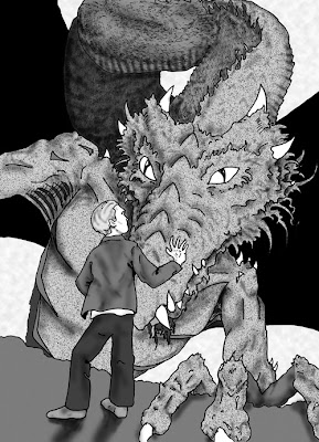
Next an image from the never-ending graphic novel project which was the original impetus for this blog...


Another image from the same project...


No it's not an homage to Led Zeplin, you stoner, it's Icarus...


This was a large diptych in oil, which is now in a private collection...


And finally, this last piece is a portrait of my buddy Mage. This was intended to be a present to him, but is now unfortunately in the private collection of a thief.

coming up soon, some excerpts from my photographic portfolio, including some arty new scooter pics. Stay tuned.

Oh and if you wish to view this portfolio of paintings and drawings in full, you can do so here.

Thursday, July 12, 2007

Ballad of the Steampunk Vespa: Part 3 Airbrush Breathes Life Into Scooter

Here again, is Quell, the Steampunk Scooter. In this pic, you can see the engine side cowl, where a convenient cog-shaped portal allows a clear view of the boiler's flames. I'm not sure how or when I decided on doing wood graining. I would have loved to hasve wood-grained the legshield... heck, I may yet, if I ever get access to a shop.
See, I think the wood works really well with the 80's angularity of the cowls. Softens it somehow.
Here we have the left handcowl, which allows the operator a clear (and perfectly safe) view of the workings of patented Tesla coil electro ignition system. Beneath this cover are the battery and spare tyre. If you click on the picture you will see a larger version, where the keen of vision will notice the aforementioned etherally scripted "Quell." You may also notice this brass scollwork protects one from gears within, whilst still allowing a view of their clock-like movement. I have to apologize for the quality of these pictures. They were all taken at night... as daylight hours have been spent on the final efforts of making the scoot road-worthy.
The beautiful and ample trunk. Transforming this vintage fiberglass topcase (donated from Jes's Sprint) into a small wooden steamer-trunk was one of the most enjoyable parts of this whole process. In the future, I'd like to give it a couple leather straps around the circumference, to finish off the steamer-trunk vibe.
Another angle on the Vespa's left posterior.

The top of the trunk.

This is my favorite picture of the trunk, so far. The flash gives some idea of how some of the layers of irridescent and metallic paint reflect and glow.It really gives the wood warmth which helps soften the angularity of 80's design.

Here's a close-up of the boiler. Though I really wanted to paint the flames with airbrush, I drop the airbrush right before this stage, so most of the flames were done with a regular brush. I think they turned out pretty good, regardless. To do them properly with an airbrush (because they are so small, like 3' by 4")I'd need an Iwata Micron...sigh... someday.

And last but not least, here is the front of the Steampunk Vespa. Simple, but I like it. This was stencil from a Dover book on Victorian embelishments. A similar but different design is on both sides of the fender as well. I like the shield design, it seems American without being too wrapped in the flag.

You can't really see it in these shots, but I coated the floorboards with truck bedliner and a no-slip coating. I also put a black rubber guard around the edge of the legshield.

Well Yikes! It's late. I've got a lot more to say about the Steampunk Vespa, and better pictures will be available shortly.So stay tuned for those, meditations on "why a steampunk scooter?", and goodies from Amerivespa. By the by, I'll be away at AmeriVespa for the next few days, so there will likely be a lapse in posting, and a delay in comments getting published. Don't worry, there'll be a lot cool weirdness next week. So be as strange as you wanna be, just don't be a stranger.

Ballad of the Steampunk Vespa: Part 2 Painting

Here's another shot of The Steampunk Vespa. It has been decided the P200e's name is Quell. A variety of names were considered... Initially I liked the Steam Pony, or Brazen Filly... Jes made the point that these were not classy enough. Jake Von Slatt recommended Eleanor, and I briefly flirted with idea of airbrushing Katherine Hepburn from the Lion in Winter. Then I realized I was up to eyeballs just getting all the art I'd started, completed. Yesterday Sky was looking at the painted brasswork on the left side cowl, and asked me, "Does it say Quell?"
Sure enough, unintentionally the scrollwork does remarkably resemble an ornately scripted "Quell." Sometimes synchronicity must just be embraced.

Anyway back to the project history...

During the first six months or so I was working nights. Work on the chasis of the scooter had to take place outside, since we have no garage. Above you see the scooter after many bouts of sanding and rust treament, all masked up pretty and ready to be painted.
I did a lot of research on painting prior to this. Unfortunately, a nice professional urethane was going to be impossible. I'd been researching rat-bikes some too. Basically I just decided to do the best I could. I had to get SOMETHING on the scoot to protect it. I also decided against doing body work. None of the dents and scrapes were severe, and they add character to a 27 year old bike with few miles on it.
So it became obvious that I must do a 3/4 ass job on the P. I didn't completely disassemble the bike before painting, I just masked like crazy. I used rattle cans for a most of my painting. I used artist grade airbrush acrylic for the custom painting, which was then covered by copious amounts of clear coat. I only airbrushed pieces that I could work on inside.
Still wavering between steampunk vespa and rat vespa, I laid a couple coats of rust resistant flat black primer. At this point I was thinking doing a kind of steampunk rat Vespa, using the black primer as a stand-in for wrought iron, and possibly painting some brass gears and scrollwork. I got a smorgasboard of various metallic paints, and one really stood out, Rustoleum's Metalic antique brass. It was so gorgeous, it became the base color for the bike.
Rustoleum also had a metalic black that was nice, so it got used for some trim painting.

And that's the scooter with the base painting, without any of the custom paint.

Coming up next: Quell, the Steampunk Vespa including ruminations and recollections from the custom painting process.

Ballad of the Steampunk Vespa: Part 1 The Vespa

That's right folks, the Steampunk Vespa is finished! Above you will no doubt observe that the Dragon is one happy mutant. Some might even say maniacally happy.
I'm really pleased by the paint job, and how all the pieces came together. I think the funkiness of P200e's 80's stylings actually take on a sci-fi 1880's facade quite well. But first how it came to be.
The 1980 Vespa P200e was purchased off ebay from an individual in Colorado. He'd been a member at ebay for several years had good feedback, and wasn't a powerseller. I could tell from his ebay history and feedback that he was the kind of guy who used ebay like the classifieds. He seemed honest, and was the second owner. He'd started fixing it up and was going to have move overseas before he could finish. He said the issue was that the scooter needed some surface rust dealt with, and needed to be painted. It only has 516 miles on it! The first owner laid it down early on, and was too scared to ride it. Seemed like the perfect gamble, I paid $1300 for it. He threw in a new Sito plus exhaust for another $50.
Shipping was a nightmare and it took almost three months for me to recieve the scoot. I think the seller charged me like $450 for air freight, but I think he may have ended up spending more than that for shipping and handling. The scooter had to be crated, and his first two tries were rejected by the frieght company. He was very communicative about the process, and I was understanding about it. I had to rent a U-Haul to go pick it up at SeaTac, and had to con Lukas into driving the U-Haul, since I didn't have my automobile license at this point.
If you're getting the feeling that this project has been an exercise in patience, you'd be correct.

Anyway here are some better shots of the cosmetic challenges I faced:

The rust was particularly bad on the floorboards. It looked like the poor scoot had sat uncovered outside for years.
This is how the glovebox looked. The seller had started on sanding down the rust but hadn't finished... so it was returning.

Treating the rust with a rust convertor. This was cool stuff!
Coming up next: Painting... where I briefly toy with the idea of a rat-bike Vespa.